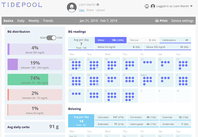
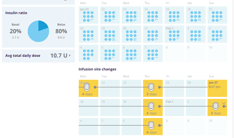
I was just going to complain about that! lol. I attempted to log in (the Dexcom clarity login page does pop up), but my credentials don’t work. Well, that’s a bummer. I’m downloading Tidepool now.
Thanks for the recommendations for Tidepool. I do like the layout…just trying to figure out how to see all the data I’d like to see. It appears you have to click back and forth between the two sets of data (BGM / CGM) via that radio button?
You can’t have BOTH sources of data plotted on the same page/graphs? I did set up Dexcom clarity to auto sync, though.
Also, understanding all the data points will take some time, but this does look very promising.
Any input for how you use Tidepool data, what comparisons you look at, what data points you consider most important to view, etc., would be appreciated. Always looking for new ways to help us all, Liam included, improve and grow!
On my Diasend (the Canadian version, so maybe it’s different), I can see CGM and PDM data but not together. They’re on different pages/tabs. Some info gets blended, like the CGM page will show carbs – or at least show that you ate, but not an amount of carbs – but the PDM page that shows BG, carbs, and insulin doesn’t incorporate the CGM number, so you can’t easily see how closely they’re matching and have to keep jumping back and forth.
Tidepool (as has now been discussed) is much better at letting you see various kinds of data in one place.
Not D’Angelo’s Brown Sugar, @elver? Was there another?? 
I’m more of a British invasion or zz top kinda guy, but D’Angelo works just fine. 
Doesn’t appear to select a date range in Tidepool? I’d like to see the last 90 days for instance, but don’t see how to do that?
The compilation page shows summaries of the CGM data and the BGM data on one page. It’s a very good place to see the differences between the two over the same time period.
The main page? The one I linked above? If so, I don’t see any differences areas where I can see the numbers side by side.
The compilation tab is the last one. It shows a summary of the CGM data and the BGM data separately, but on one page. It’s a good way to see the differences between the two. Note that I am looking at the desktop, not the app.
I don’t see a screen that looks at all like that. Could you give me a step-by-step from the main screen I linked above? All I see are “Basics, Daily, Weekly, Trends”
@ClaudnDaye, I am sorry to say that I just saw the URL - once I log in it changed to ‘international.diasend.com’. There must be a different version of Diasend for Canada and the US 
Oh, the images above are for Tidepool! Somehow I thought you were talking about Tidepool. lol. We got our wires crossed. I did not go with Diasend at all because I couldn’t log into my Clarity account. Thanks!
“Who’s on First. What’s on Second. I don’t know is on Third.”

Oh no. I think we might have the same endocrinologist. After wearing the Dexcom G6 for 8 days I noticed that I didn’t feel well unless my BG was over 125. My endo recently had me in her office all day to fast and have labs drawn. My CGM and my glucometer are usually within 5-10 points of each other. When I was fasting my CGM said I was 125, but the doctor’s glucometer clocked me at 72. I knew by my symptoms that her’s was accurate. They checked me every hour, and I was consistently significantly lower than the CGM said I was. For this reason I don’t want my endo to use Clarity because it doesn’t accurately reflect my BG values.
Another thing I wonder about is how the G6 can give accurate A1C results when over a 90 day period it has to be off for two hours for sensor change every 10 days. That’s 18 hours, not to mention days one might go unmonitored while waiting for a replacement sensor to be delivered the next day.


